How to Show a Sales Counter Without a Popup
Social proof does not have to arrive as a corner toast. Here are the three places a sales counter can live on a Shopify page, and how to build each one.

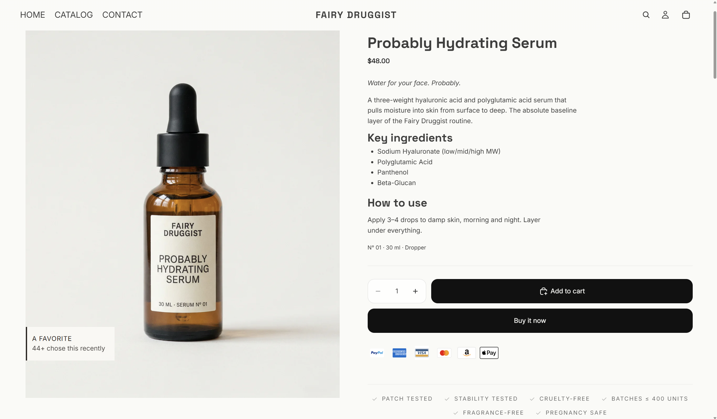
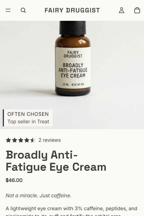
Put the number where the decision happens, not in a corner toast. Three placements work on Shopify: overlaid on the product image, inline beside the price or add to cart button, and as a badge on collection grid cards. All three are theme edits, not popups.
The popup is a convention, not a requirement. It became the default because it is the easiest thing to bolt onto any theme without touching the template, which is a fact about installation difficulty rather than about what works.
What is actually wrong with the popup
Nothing, on a desktop, for a shopper who is browsing. It is genuinely good at being noticed.
The problems are specific and mostly mobile:
- It arrives uninvited and asks to be dismissed. Every dismissal is a small negative interaction you paid for, and once a shopper has closed one, they will close the next four without reading them.
- On a phone it competes with the buy button. Most themes put a sticky add to cart at the bottom of the viewport. A corner toast lands in roughly the same place.
- It is about a different product. A toast saying somebody in Toronto bought a candle is not evidence about the item currently on screen. It is evidence that the store is alive, which is a weaker claim made at a more expensive moment.
- It reads as an app. Shoppers have seen the pattern enough to recognise it, and recognising it invites the question of whether it is real.
Inline placement gives up the interruption and gains relevance. The number is about the product being looked at; it is there when the shopper reaches the buy decision, and nobody has to close anything.
The three placements
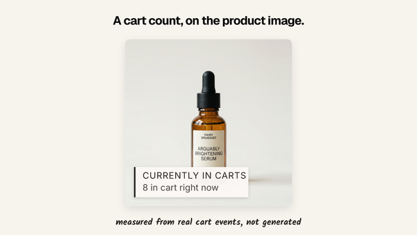
On the product image
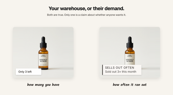
The most visible option, and the one that survives a screenshot. A small label sits on the image itself, so the number travels with the product into search results, social posts and comparison tabs.
Keep it in a corner, keep it small, and keep it off the part of the image the product
occupies. The failure mode is a label that obscures what you are selling, trading a conversion for a proof point.
Inline near the price or add to cart
The quietest option and usually the best converting, because it sits exactly where the decision is made. A single line of text under the price: 412 sold, or 38 sold this week.
This is also the easiest to make theme-native. Use your theme's existing type styles rather than a boxed widget with its own border and background, and it reads as part of the page instead of an addition to it.
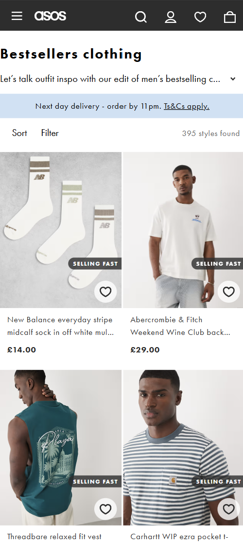
On collection grid cards
The underused one. A badge on the card in a collection or search results page tells a shopper which products are working before they click into anything, which changes what they click.
For a store whose traffic lands on collections rather than products, this is often worth more than the product page treatment.
Building it yourself
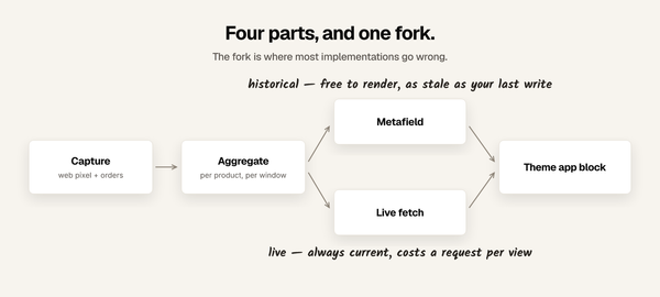
The mechanism is the same metafield approach covered in
how to show units sold on a Shopify product page:
get the number into a product metafield, then print it in the template.
The placement work is theme editing:
- Inline is the easy one. On an Online Store 2.0 theme, add a text block to the product section in the theme editor and reference the metafield. No code.
- Image overlay needs CSS. The image container needs position: relative, and the label needs position: absolute inside it. Check it at mobile widths, where the image is smaller, and the
label is not. - Collection cards means editing the product card snippet, usually
snippets/card-product.liquidon Dawn-derived themes. Every card in every collection uses it, so test it against a product where the metafield is empty and make sure you render nothing rather than a blank badge.
The last point is the one that catches people. Wrap every output in a check that the value exists and is above whatever floor you choose, or your quiet products get a badge announcing
that they have sold zero.
Using an app instead
Disclosure: I built one, so read this as disclosed rather than neutral.
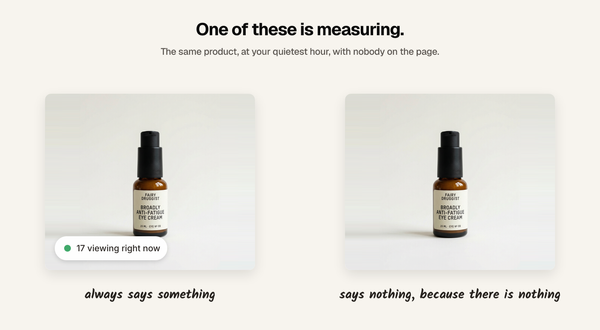
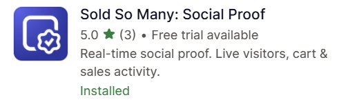
Sold So Many was built around inline placement rather than the toast. It puts sold counts, live visitor counts, recent purchases, and cart activity on the product image, inline on the page, and on collection grid cards, with six preset families and three density levels so you can tune it from subtle to prominent against your theme. You can also choose which signal appears on which products rather than applying one widget everywhere. It is rated 5.0 from 3 reviews, free up to 10,000 visitors a month, and $19 a month above that.
If you only need one number in one place and you are comfortable in your theme code, the metafield route above costs nothing and is a legitimate answer.
Where to put it, if you only do one
Inline, under the price, on product pages.
It is the cheapest to build, the hardest to get visually wrong, the closest to the decision, and the least likely to be mistaken for an advertisement. Add the image overlay when you want the number to survive being screenshotted, and the collection badges when your traffic lands on collections.
FAQ
Can I show social proof on Shopify without a popup?
Yes. Sales counts can be rendered directly in the product template, overlaid on the product image, or added to collection grid cards. None of these requires a popup or an overlay.
Where should a sold count go on a product page?
Near the price or the add to cart button. That is where the buying decision is made, and it is where the number is most likely to be read.
How do I add a sales badge to Shopify collection pages?
Edit the product card snippet, typically snippets/card-product.liquid on Dawn-based themes, and render the value from a product metafield. Guard the output so products without a value render nothing.
Do inline counters convert better than popups?
They are relevant to the product on screen and cost no dismissal, which is the argument in their favour. Whether they convert better on your store is worth measuring against a holdout rather than assuming.
Will an image overlay hurt my product photos?
It can, if it is large or centred. Keep it to a corner, keep it small, and check it at mobile widths where the image is smaller but the label often is not.
Written by Mehmet Tekin, 23 August 2026. I built Sold So Many,
a Shopify social proof app that puts its numbers inline rather than in a popup.