Installing Rubik Variant Images on a Store With Too Many Variants
A dog bed store with three colours, four sizes and forty photos per product is exactly the mess Rubik Variant Images was built for. I installed it on Birdsong Pet and paid close attention to the onboarding — because I've spent the last six months rebuilding my own.

I spend most of my time building a Shopify app, which means I install a lot of other people's Shopify apps. It's partly research and partly nosiness. When you've stared at your own onboarding flow for six months, you start reading someone else's like a book.
So this post is two things at once. It's a genuinely useful review of Rubik Variant Images & Swatch if you run a variant-heavy store. And it's a look at how the app is built, from someone who has made most of the onboarding mistakes it manages to avoid.
The problem, on a real store
I installed it on Birdsong Pet, a dog bed store. It's the ideal test case, because it has the exact catalogue shape that breaks Shopify's default behaviour: lots of products, each with several sizes and several colours, and a big pile of photos per product.
Take the Birdsong Pointy Dog Cave. It comes in Beige, Brown and Gray, in multiple sizes, and the product has something like thirty images attached to it — lifestyle shots, a cat in a beige one, a puppy in a brown one, size charts, packaging.
Out of the box, Shopify's product gallery shows a customer all of those images regardless of which variant they've selected. Someone who wants the grey cave gets scrolled past a dozen photos of the brown one. That's a bad experience, and it's a return waiting to happen. The customer builds a picture in their head from images of a product they didn't actually buy.
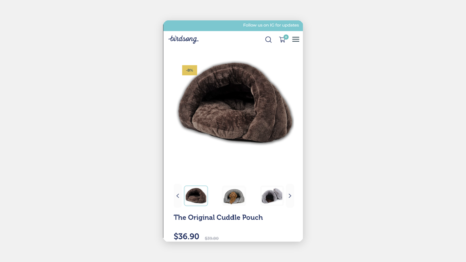
Caption: Birdsong's own Cuddle Pouch page, before Rubik. The main image is brown; the thumbnail strip underneath runs brown, grey, grey. Every colour, all at once, for every shopper — and this is the mobile view, where the scrolling hurts most.
What you want is obvious: pick Brown, see the brown ones. That's the entire job of this app.
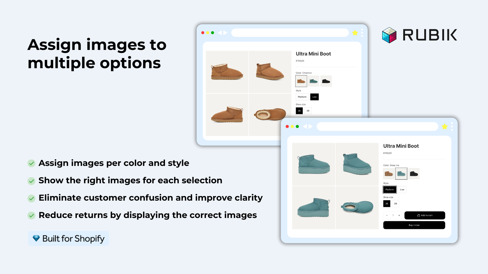
Caption: The customer-facing result, from Rubik's own listing. Pick a colour, get that colour's photos — and nothing else. (Image: Rubik's App Store listing)
Everything from here on is what it takes to get there, which — spoiler — is less than I made it.
Installing it
Standard Shopify install, then the app opens on a home screen with a setup guide sitting right at the top.
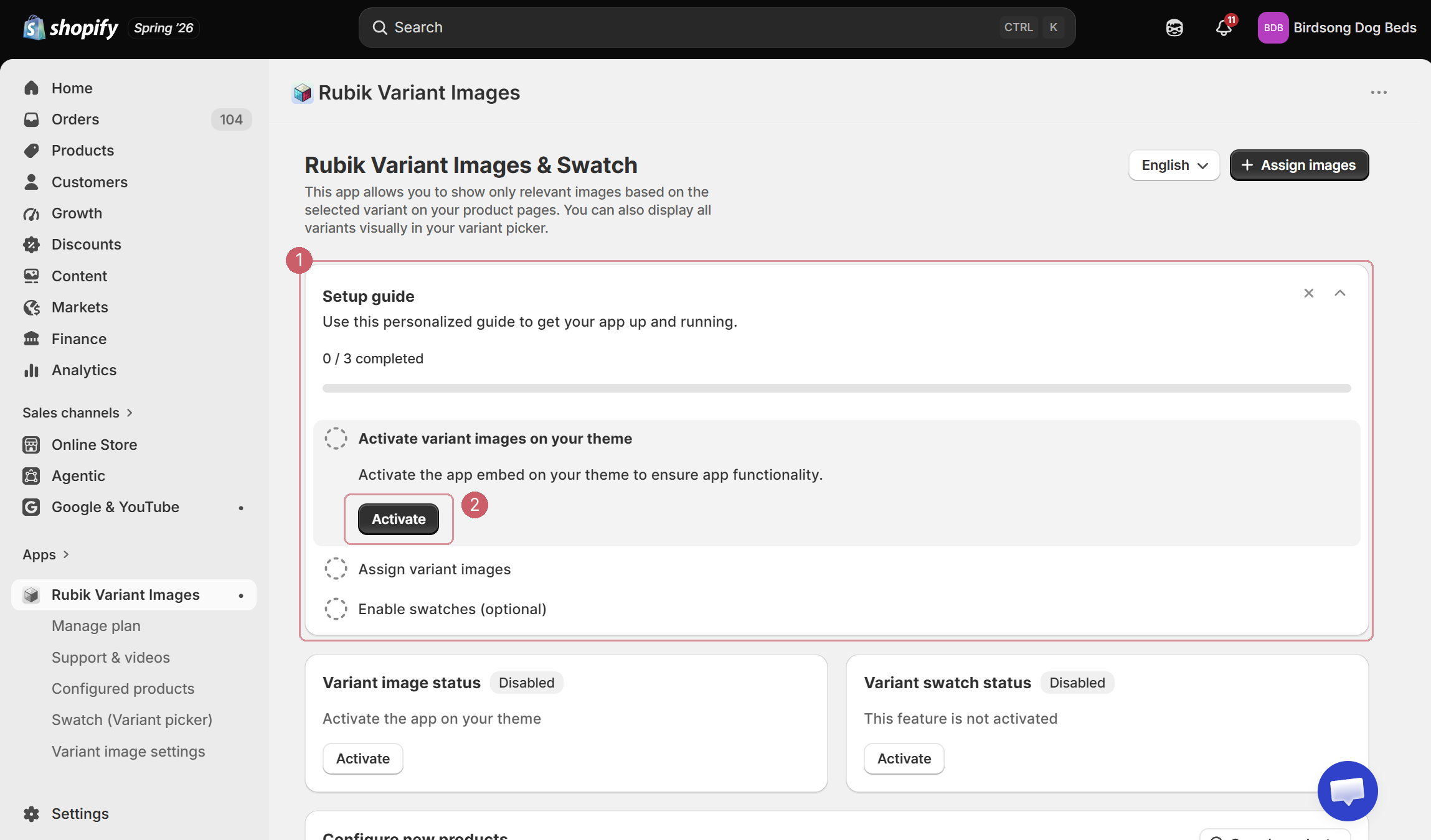
Caption: ① The setup guide, sitting at the top of the app home screen. ② The Activate button, which deep-links straight into the theme editor.
I want to dwell on this for a second, because it's the part I have opinions about.
Rubik works through a theme app embed — it can't do anything until you switch that embed on. And an app embed is a genuinely awkward thing to ask a merchant to enable, because the toggle lives over in the theme editor, not in the app. It's a click that leaves the app entirely.
Rubik handles it the right way. The setup guide ① is at the top of the page, it's three tasks, each task has exactly one action attached to it, and the first one is a big Activate button ② that deep-links you straight to the theme editor with the embed ready to enable. No searching. No instructions to read. The call to action is on the button.
I'm being emphatic about this because I wrote a whole post about getting it wrong. In the first version of Sold So Many, my activate button was buried in a card that nobody could find, and I watched merchant after merchant install the app, fail to switch it on, and uninstall it. A setup guide with numbered tasks and one action each was the fix. Seeing the same pattern here, executed cleanly, was a small professional pleasure.
The other two tasks — assign your images, and optionally enable swatches — follow the same shape.
Assigning images
This is the core of the app, and it's where an app like this either respects your time or wastes it.
You pick a product, and Rubik asks which option should drive the images ①. For the dog cave that's Colour, not Size — a Large Brown and a Small Brown look the same, so there's no point assigning per size. You toggle between the options at the top and Rubik lays out each value underneath, with a drop zone next to it.
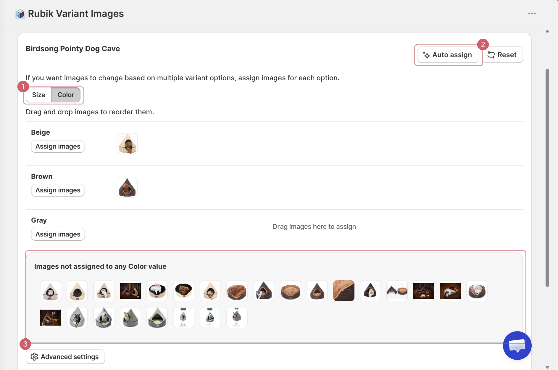
Caption: ① The option toggle — Size or Colour. ② The Auto assign button. Remember this one. ③ The pool of images not yet assigned to any colour.
Two details I liked here.
First, the pool of unassigned images ③ is visible at the bottom, labelled "Images not assigned to any Color value." You always know how much work is left. That's a small thing that stops the task feeling open-ended.
Second, assignment happens in a modal, and the modal is a proper one.
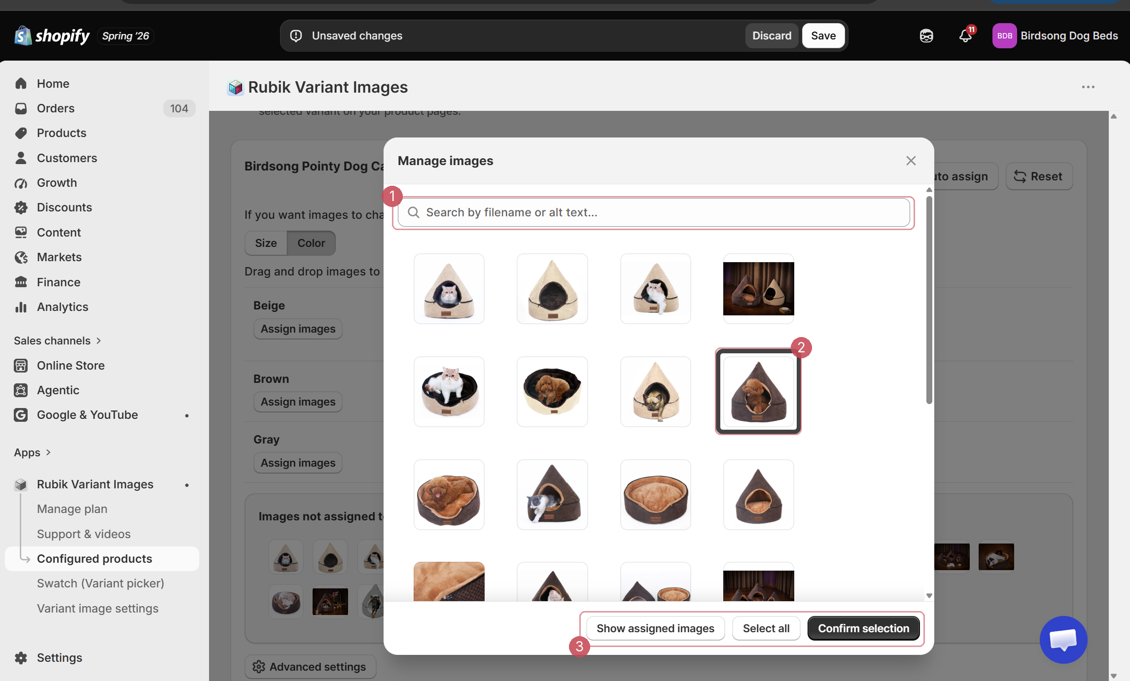
Caption: ① Search by filename or alt text. ② Click a thumbnail to select it. ③ Select all, filter to already-assigned images, and confirm.
You get a search field ① that matches on filename or alt text, click-to-select thumbnails ②, and a Select all with a Show assigned images filter ③ so you can check your work without leaving the modal.
If your images are named sensibly — pointy-cave-brown-01.jpg and so on — you type "brown" into ①, hit Select all, confirm, and a colour is done in about five seconds. If they're named IMG_4471.jpg, you're clicking thumbnails. Either way, you're working inside the modal rather than bouncing between screens, and drag-and-drop reordering works for setting which image leads.
The whole thing is built in Shopify's own admin design language. It looks like Shopify because it is Shopify's component library, used properly. Nothing about it feels like a third-party app bolted on, which is more than I can say for a lot of what's in the App Store.
Save, and the product shows up under Configured products with a timestamp.
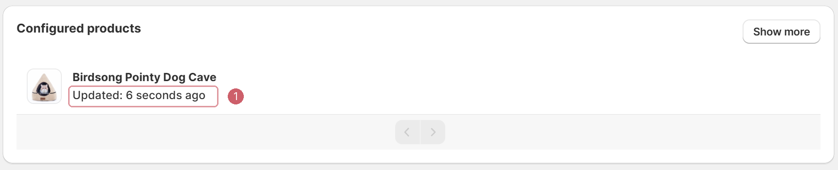
Caption: ① A timestamp on every configured product, so you can see at a glance what's actually set up.
The feature I completely missed
Here is my one genuinely useful contribution to this review, and it is entirely at my own expense.
While I was clicking through thumbnails, assigning the brown photos to Brown, I wrote a note to myself: "What if it actually did the selection automatically, with the help of AI?"
It does. There is an Auto assign button. It is at the top right of the screen I was working on. It is in the screenshot I took at the time — go back and look at ② up there, the one I told you to remember. Their pricing plans are literally metered on it: the free plan gives you 50 AI auto-assigned images a month, and it scales up from there to 50,000 on the top tier. I sat there hand-sorting dog beds next to a button that would have done it for me.
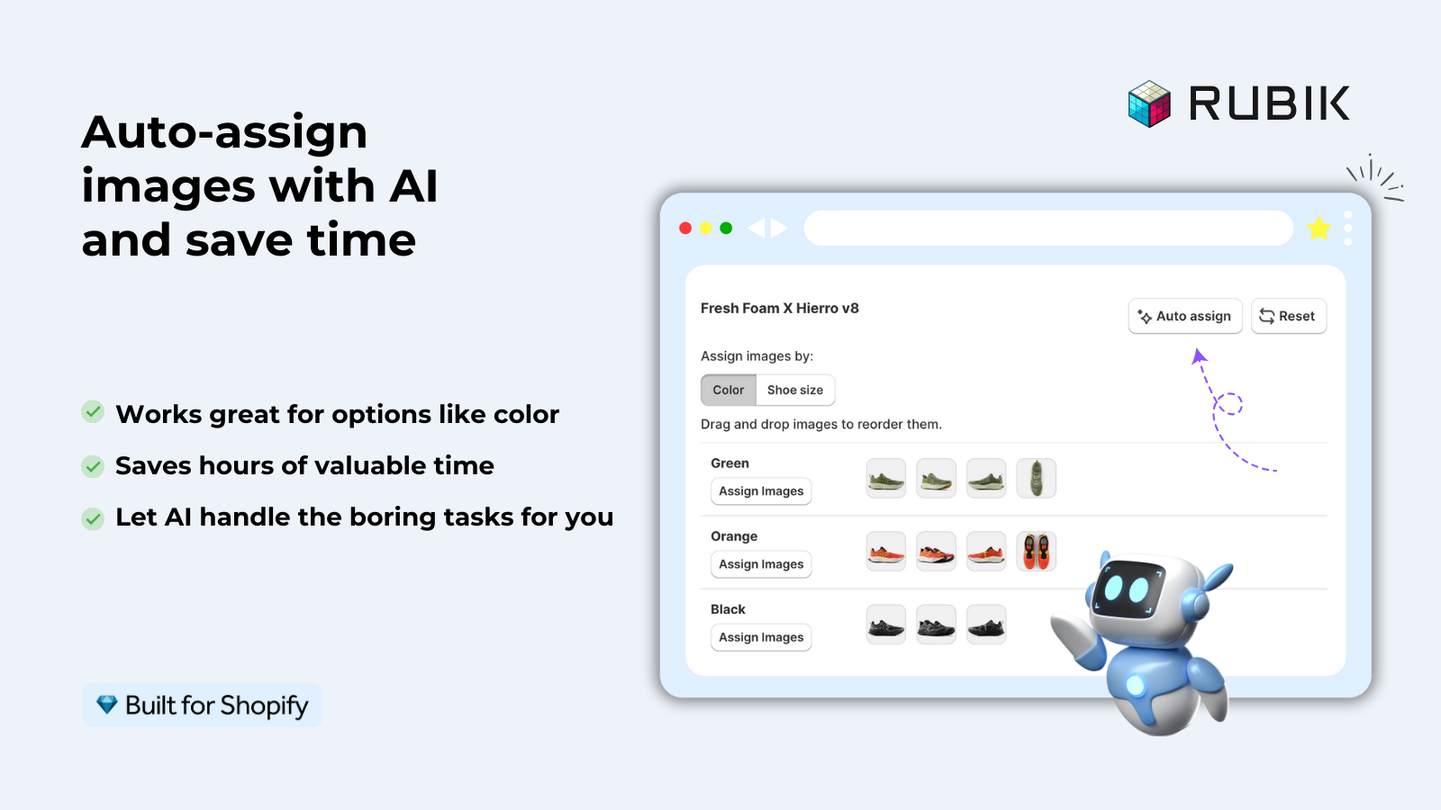
Caption: To be completely fair to Craftshift, they are not exactly hiding it. (Image: Rubik's App Store listing)
So: two things are true at once. The manual flow is good enough that I happily used it without ever wondering if there was a faster way — which is a real compliment. And the single highest-value feature in the app was, for one merchant at least, invisible. If anyone at Craftshift reads this: it might be worth making Auto assign the first thing you're offered on a product, rather than a button sitting parallel to the manual path. I'd have taken it instantly.
Consider this a public service announcement for everyone else. Press the button. Don't be me.
Swatches
The third setup task is optional, and it's the other half of the app: turning the variant picker itself into image or colour swatches, rather than text buttons.
For a store like Birdsong, where the colour is a big part of the buying decision, this is worth switching on. A row of little beige/brown/grey thumbnails communicates instantly in a way that the words "Beige", "Brown" and "Gray" don't. It's the same idea as the image gallery — show, don't tell — applied to the picker.
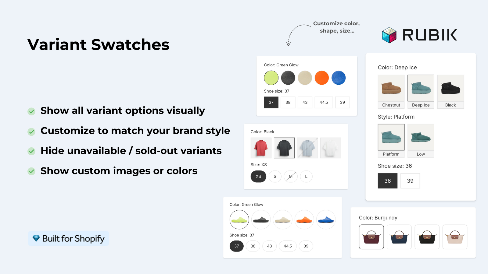
Caption: Colour circles, image thumbnails, struck-through sold-out sizes. I left this switched off, so I'm showing you Craftshift's example rather than pretending otherwise. (Image: Rubik's App Store listing)
The part I'd actually use is the sold-out handling — striking through or hiding variants you can't ship. That's a small mercy for the customer and one fewer support email for you.
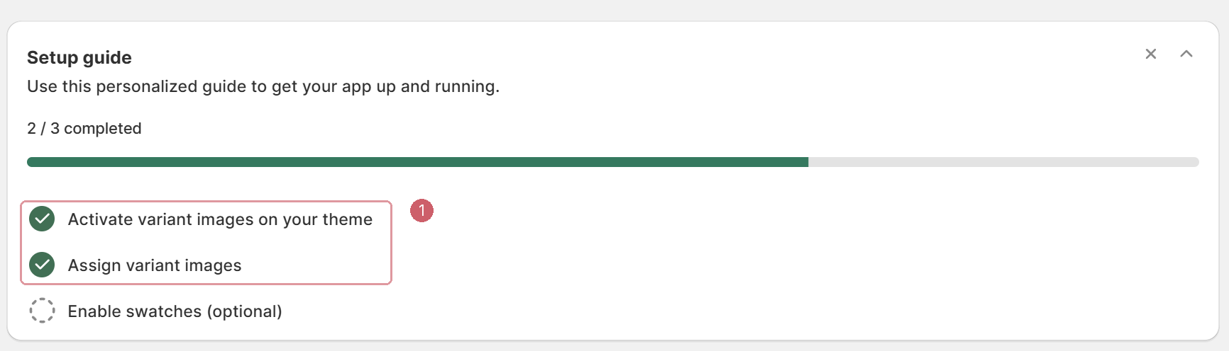
Caption: ① Two of three done, and the third is optional. That's a good onboarding.
What it costs
At the time of writing there's a free plan that covers a single product with 50 AI auto-assigned images a month — enough to try it properly on one product and see it working on your live store before you commit.
Paid plans start at $25/month for 100 products, $50/month for 1,000, and $75/month for unlimited, with annual pricing knocking a couple of months off. Every plan includes the swatches, multiple variant options, and theme setup support, so you're paying for scale rather than for features.
For a store where variant confusion is actively causing returns, the maths on that is not hard.
Would I recommend it?
Yes, straightforwardly.
If you sell one product in one colour, ignore all of this. But if your catalogue looks like Birdsong's — many products, several colours each, a photo library that's grown organically over years — then your product pages are currently showing customers a lot of things they didn't ask to see, and this fixes it in an afternoon. Less for the whole store if you use the button I didn't.
It's from Craftshift, a small team, and it's sitting at 5.0 stars across around 400 reviews, which I find easy to believe having used it. It's a focused app that does one job, respects the admin UI, and — the thing I care about most — doesn't make you guess what to do next.
Here is the website of Craftshift, where you can view other exciting projects they're working on such as the [Rubik Combined Listings] (https://apps.shopify.com/rubik-combined-listings).
Rubik Variant Images & Swatch on the Shopify App Store →
I build Sold So Many, a Shopify app that shows how many units a product has sold recently. It's on the same page as Rubik, philosophically: give the customer the information they'd have asked for anyway. If you've got an app you think I should install and pull apart, I'd love to hear about it.