Fixing the Onboarding Flow of "Sold So Many": Lessons from My First Shopify App
Over the past month since launching my first Shopify app, Sold So Many, I've embarked on a steep learning curve in programming: UX, and UI design. While I anticipated challenges, the initial user engagement metrics signalled that I needed to make significant improvements.
The Problem
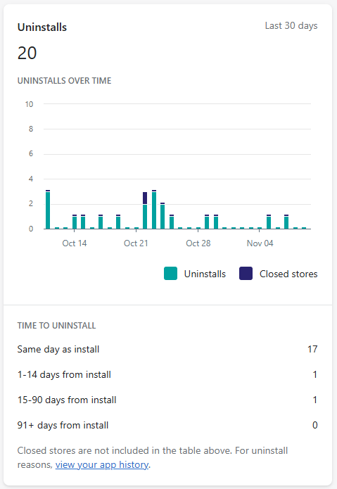
In the last 30 days:
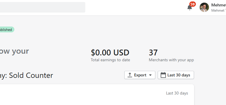
- 28 installs
- 20 uninstalls
A retention rate like this is a clear indicator that users are encountering obstacles significant enough to abandon the app shortly after installation.
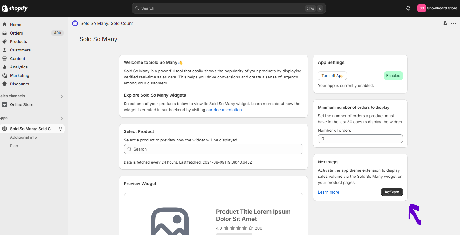
Upon closer inspection, I realized that users struggled to locate the correct card on the main page to click the Activate button. This deep link is crucial as it adds the app block to the merchant's live online theme—a step that none of the users were able to locate.
Investigating the Issue
Initially, I relied on Mixpanel event triggers to track user behavior. While helpful for understanding user flow, these server-side events lacked the granularity to pinpoint where users were getting stuck.
I mistakenly believed that recording user activity within Shopify apps wasn't feasible due to the iframe embedding. However, thanks to the supportive community on X (formerly Twitter), I learned about Microsoft's Clarity, a tool capable of recording user sessions within an iframe.
A special thanks to @Sweta for pointing me in the right direction.
Huge thanks to a fellow Shopify founder, @Swetamohanty94, who generously took the time to jump on a call with me today, purely to help! 🙌 It's amazing to be part of such a giving community. Your kindness and support mean a lot! #ShopifyDev
— Mehmet Tekin (@mehmettekn) October 24, 2024
#ShopifyDev
Analyzing User Sessions
Watching the Clarity recordings was an eye-opening experience (pun intended). It became evident that the app's main page (app._index) was far from intuitive. To gather more insights, I asked Kaan Karakeben, one of my best friends, to test the app while I watched him in person, over his shoulder. His immediate feedback highlighted several UX issues:
- The app toggle component wasn't clear
- There was confusion in what's called the widget vs what's called the app
- The live preview seemed like the primary action to be taken because of it location
Implementing Improvements
Based on these findings, I prioritized and implemented the following changes:
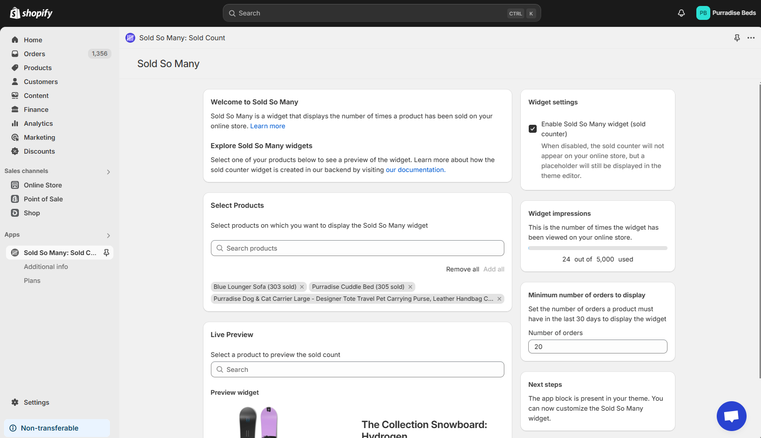
- Old Flow: Users were prompted to choose a plan first and then set up the app. There was no clear priority of actions, no setup guide, and all products were included by default—a choice that confused users who didn't realize all products were added or who didn't want to include every product.
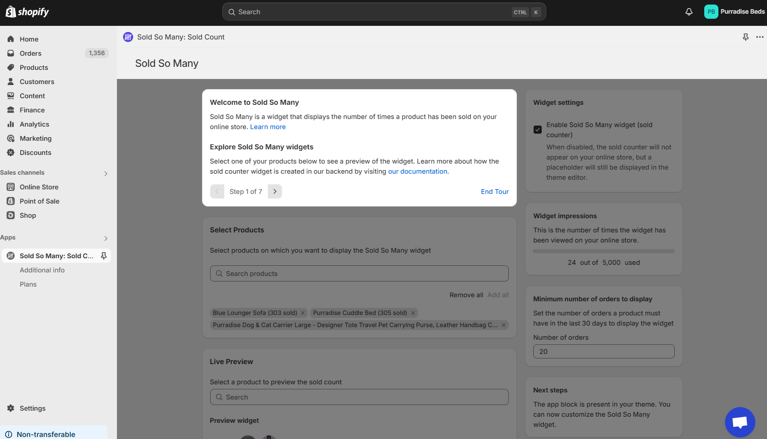
- New Flow: Users now:
- Set Up the App Block First
- Select Products to Include
- Configure and Enable the Widget
- Encounter Upgrade Prompts after significant app engagement or when they see the verified icon on the tooltip.
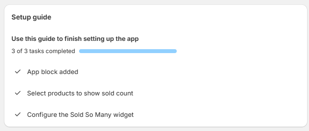
- Created a setup guide that dynamically updates based on the user's configuration, providing clear instructions at each step.
- Improved the toggle component using Polaris best practices to make it more intuitive.
- Developed a walkthrough that focuses on a single card while masking the rest of the iframe with an overlay. It includes navigation controls at the bottom, mapping each step to a URL and handled by server-side state using Remix's APIs.
- Monochrome Main Route: Simplified the visual design to reduce distractions.
- Guide Texts: Enhanced the clarity and helpfulness of instructional texts.
- Introduced "Add All" and "Remove All" buttons for quicker product management, giving users better control.
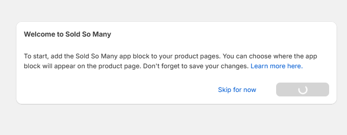
Revamped the app toggle


Monochrome, and following the Polaris guidelines, I used a checkbox instead of a button that calls to action. I also avoided the confusion by using the word Widget instead of App and provided ample explanation regarding what the control is doing.
Setup Guide
App tour

- Developed an interactive walkthrough that guides users through the setup process step by step. Each step in the tour corresponds to a unique URL, allowing users to navigate back and forth seamlessly. By leveraging Remix's APIs and server-side state handling, the app maintains state across these URLs without requiring additional client-side state management.
- The walkthrough focuses the user's attention on one element at a time by masking the rest of the interface with an overlay. This simplifies the user interface during onboarding and enables users to share or bookmark specific tour steps. Handling the state server-side ensures that the user experience remains consistent and reliable, even if they refresh the page or return to the app later.
Before and After

The Results
The first user who installed the app after these changes successfully added the app block—progress! However, they uninstalled shortly after due to an oversight on my part: I left a development variable active in the production environment.
pending: process.env.NODE_ENV === "production" ? pending : false,I've since corrected this rookie mistake and emailed the user, hoping they'll give Sold So Many another chance.
Conclusion
This journey has underscored the importance of user experience and thorough testing. As a novice developer, I learned that attention to detail can make or break user engagement. I'm committed to continuous improvement and am eager to see how these changes enhance user retention.
Thank you for joining me on this journey. I'd love to hear from you if you have any feedback or suggestions!
